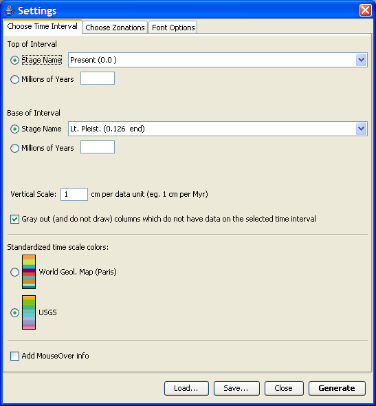
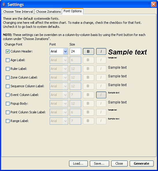
TimeScale Creator Overview


File Menu

  • Replace Data with Built-In - This happens automatically when the program starts. Load the datafile built into the program while discarding all current data and settings. Recommended for most uses.
  • Add Data From File - Load another datafile, appending its columns into the currently loaded set. Use this if you have custom or updated data.
  • Replace Data with File - Load another datafile while discarding all current data and settings.
  • Save SVG - This option is enabled once an image is generated. It lets you save the image as an SVG (Scalable Vector Graphics) file.
  • Save PDF - This option is enabled once an image is generated. It lets you save the image as a PDF file. Note that the text in the resulting file is not selectable or editable.
  • Exit - Quits the program.

Image Menu

  • Settings... - Opens the Settings window. Here you can set how you want your image to look. See below for more info about this window.
  • Generate Chart - Once you've set your settings, this option will actually create the image. Note that generating an image can be slow for large time intervals and many selected options, especially on slower computers.

User Guides Menu

  • Quick Start Guide - A bare minimum tutorial to getting an image on the screen.
  • Tour - a longer tutorial that walks you through generating an image along with some other information.
  • Features reference - this guide.
  • License - The license to this software. It is nearly identical to the Apache License version 2.0.
  • File Format info - a document listing all the options available in the datafile, in case you'd like to create your own. It is recommened that you use an already working datafile as a template, using this document as a reference.
  • About - Copyright, version, and a quick FAQ.

Settings Window

There are three different tabs in the Settings window.

Bottom Buttons
  • (Label) - Shows information about any errors in the configuration.
  • Load... - Loads a settings file.
    NOTE: The settings for columns are identified by column name and type only. So if you use a different datafile that has columns with the same names as those you had when you saved the settings, then the same settings will be applied to you new columns. Please avoid multiple columns of the same type with the same name as they might get confused. Settings for columns which are not present in the loaded dataset will be silently ignored.
  • Save... - Allows you to save the current settings to a file.
  • Close - Closes the settings window. All options are saved as they're changed, so there is no "Cancel" button.
  • Generate - Closes the settings window and starts generating the image. This is a shortcut to clicking "Close" then "Generate Chart"
Choose Time Interval

This tab lets you select when you'd like your diagram to start (Top of Interval) and when you'd like it to end (Base of Interval)

Both of these are selected in two ways:

  • Stage Name - The program knows about when various stages start and end, and you can use these names to select your interval.
  • Millions of Years - Manually enter the date.

There are also other options:

  • Vertical scale: - This lets you specify how vertically dense the image is. The larger the number here, the more spread out (vertically) the image will be. This is useful if you are interested in time intervals where many things happen close to each other and the image is just too cluttered.

    If you save an SVG file, the file specifies that 1 myr should be 1 cm on the printed page. This matters if you import the file into an application like Adobe Illustrator which lets you print the image.

  • Gray out: - Many columns only have data on a relatively short time interval, and this option lets you automatically disable them if they don't have any data in the chosen interval. The disabled columns are marked with a "(NO DATA IN TIME INTERVAL)".
  • Standardized time scale colors: - This specifies which color scheme to use for columns which have the "Set to Chronostrat" background color.
  • Add MouseOver info - This enables "popups". Some data points have more information than can be cleanly displayed, so this is a way to display that extra information.
    Simply move your mouse over the generated image and if more information is available a red circle will appear:

    Clicking (doesn't have to be on the red circle) will pop up a box:

    Use the up/down arrows to scroll the text, and click anywhere on the popup to close it. Some popups have links to a website. These are underlined. Clicking on one will open your web browser to that page.

    Note: This functionality is saved if you export the SVG file, but the software reading the file must support scripting for it to work.

Choose Zonations

This tab lets you select what data columns you'd like on the image.

The window is broken down into two parts:

  • Left side - Here you see all the columns that are present in the data file. The Age column is always available.
    To enable a column, i.e. to have it display on the final image, simply check the checkbox next to its name.
    Some columns have other columns as children. This is simply a way to group them. Disabling the parent column, (ex. Standard Chronostratigraphy) will automatically disable all the children (ex. Eon, Era, Sub-Era, etc). The checkboxes for the sub columns may still be checked, but they will not be in the final image.

    A "(NO DATA IN TIME INTERVAL)" appears in a column name if the "Gray out" option is checked in the Time settings AND the column has no data in the specified time interval. This column will NOT be drawn. If a group has no data in any of the sub columns then the entire group will not be drawn.

  • Right side - This allows you to set extra options for the column selected (highlighted) on the Left Side:

    • Color - The background color of the column. Any column can have the Chronostrat color scheme selected in the Time settings. You can also specify your own color (click Choose). "Reset" will restore the color to the default one.
    • Fonts - Lets you change the fonts of the column and its sub-columns. Note that font options for the root column ("Chart title") simply take you to the "Font Options" tab. See detailed explanation below.
    • Edit Title - Lets you change the title of the column.
    • Width - Lets you change the width of the column. This is useful if you find the text to be too crowded, or there is too much empty space.
    • Show Age Labels - Most columns can show small labels with the age of the data they're displaying. You can enable that here.
    • Up / Down Arrows - This lets you move the columns around with respect to each other. The topmost column on the list will be the left most column on the image.
    • Column-Specific Options - Some types of columns have extra options. Highlighting one of these columns will make the extra options appear in the space below the arrows. See below for more details about these extra options.
    • Information and References - Many columns have extra information about them and some references to the data. More complete references are available for download from the TSCreator web site.

Font options Click "Fonts" to show this dialog.

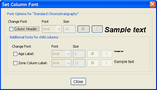
This dialog lets you choose the fonts used by the column. ALL SUBCOLUMNS OF A GROUP COLUMN WILL INHERIT THESE SETTINGS. There is currently no way to just set a font for a single column.

  • Change Font - Click the check box to override the default font for the column.
  • Rest of options - Choose your font.
  • Sample Text - This shows a preview of the actual font that will be used. If a column inherits a font, then that font will be shown here.
  • Additional fonts for child columns - These options only appear for a group column. These are fonts not used by the group column itself, but by subcolumns of the group. It's a convenient place to change a font for all the subcolumns.


Zone Columns These columns display text.

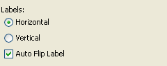
These options are for the orientation (horizontal or vertical) of the text.

  • Horizontal - Make the text horizontal by default.
  • Vertical - Make the text be on its side by default.
  • Auto Flip Label - Let the program automatically change the orientation if it thinks doing so would make it more readable. The program will look at each label individually to make this assessment.


Graph Columns These columns display graphs.
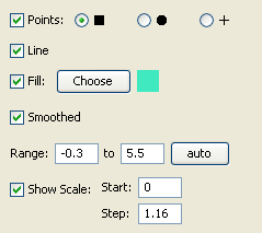
  • Points - Check this if you'd like each datapoint to have an icon. Choose between a square, a circle, or a cross.
  • Line - Check this if you'd like a line to connect the datapoints.
  • Fill - Check this if you'd like the area between the datapoints and the right margin to be filled with a color. Click Choose to pick the color.
  • Smoothed - Check this if you'd like to use a smooth line/fill between the points, not just a line segment. The smoothing creates a cubic Bezier curve.
  • Range - The range of the data to display. Either enter one manually, or click auto to find one which shows all points with a small margin on each side. Currently the auto range is based on the entire dataset, not just the visible one.
  • Show Scale - Check this if you'd like a line to show a scale on top of the column. "Start" is the center of the scale, with a tick every "Step". So in the given example there will be a tick at 0, 1.16, 2.32, etc. Changing the "Start" to 1 would mean a tick at -0.16, 1, 2.16, 3.32, etc. NOTE: clicking Auto on the range will also automatically set a default scale.


Grouping Columns These columns group other columns together.

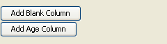
  • Add Blank Column - Insert an empty column. This is useful if you want to reserve space in the diagram which you will later fill in by hand in a graphics program.
  • Add Age Column - Insert another Age column. This will be inserted at the end of the group and the new Age column will automatically be a mirror of the single default one. Useful for large diagrams where the age scale is physically far away.


Sequence/Trend Columns These columns show changes in a certain variable, like sea levels.

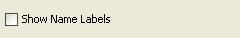
  • Show Name Labels - Add a little label to show the name of the event.


Event Columns These columns show various events. They can display their data in two different ways.

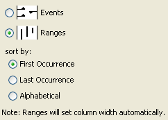
  • Events - Show the data as a series of arrows pointing UP for a first occurrence (FAD), DOWN for last occurrence (LAD), or RIGHT for a single event.
  • Ranges - Generate a range chart. There is a line connecting each first occurrence with its last occurrence. Single events are currently not displayed. Note that these individual ranges can take up a lot of space and so the column will make itself as wide as it needs to be to show all data in the current time interval.
  • Sort by - Specifies how the ranges should be sorted.


Age Columns These columns show a simple time scale.

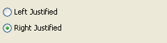
  • Left Justified - The time ticks are on the left side of the column. If you click "Add Age Column" in the options of a Grouping column then this is the default.
  • Right Justified - The time ticks are on the right side of the column.


Other Columns All other types of columns.

  • No Extra Options.

Font Options

This tab specifies the default fonts for the generated image.

  • Change Font - Click the check box to override the default font.
  • Rest of options - Choose your font.
  • Sample Text - This shows a preview of the actual font that will be used.